IY461: Statistical Report Assignment Help
Question
IY461: This assignment requires the student to provide a statistical analysis report for the Kaplan International Pathways for randomly generated data through Excel which is provided to the student. A detailed outline of how the statistical analysis is done along with the software should be highlighted. Following this analysis, the students should answer the question corresponding to the dataset.
Solution
The solution incorporated a statistical analysis report on the relationship between two variables X and Y. The solution is divided into the following sections:
The report begins with a short introduction. Our experts have provided a brief aim of the report and the dataset used for analysis is also provided in this section.
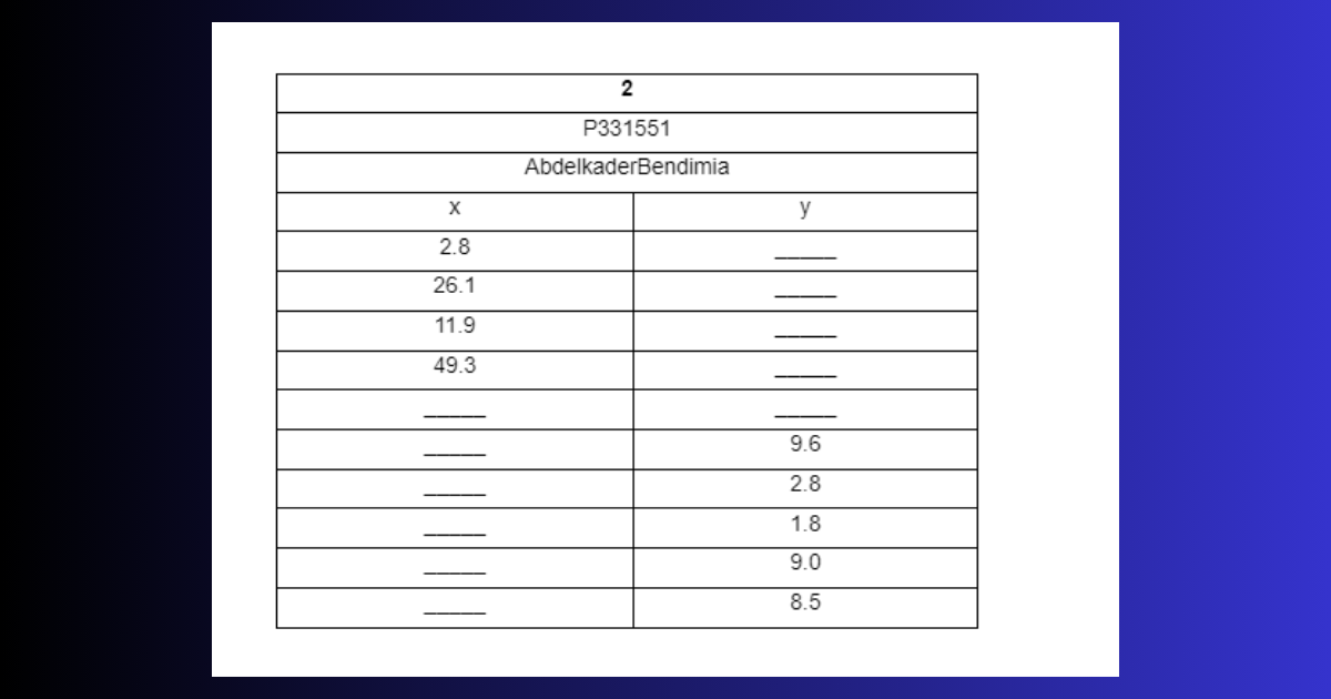
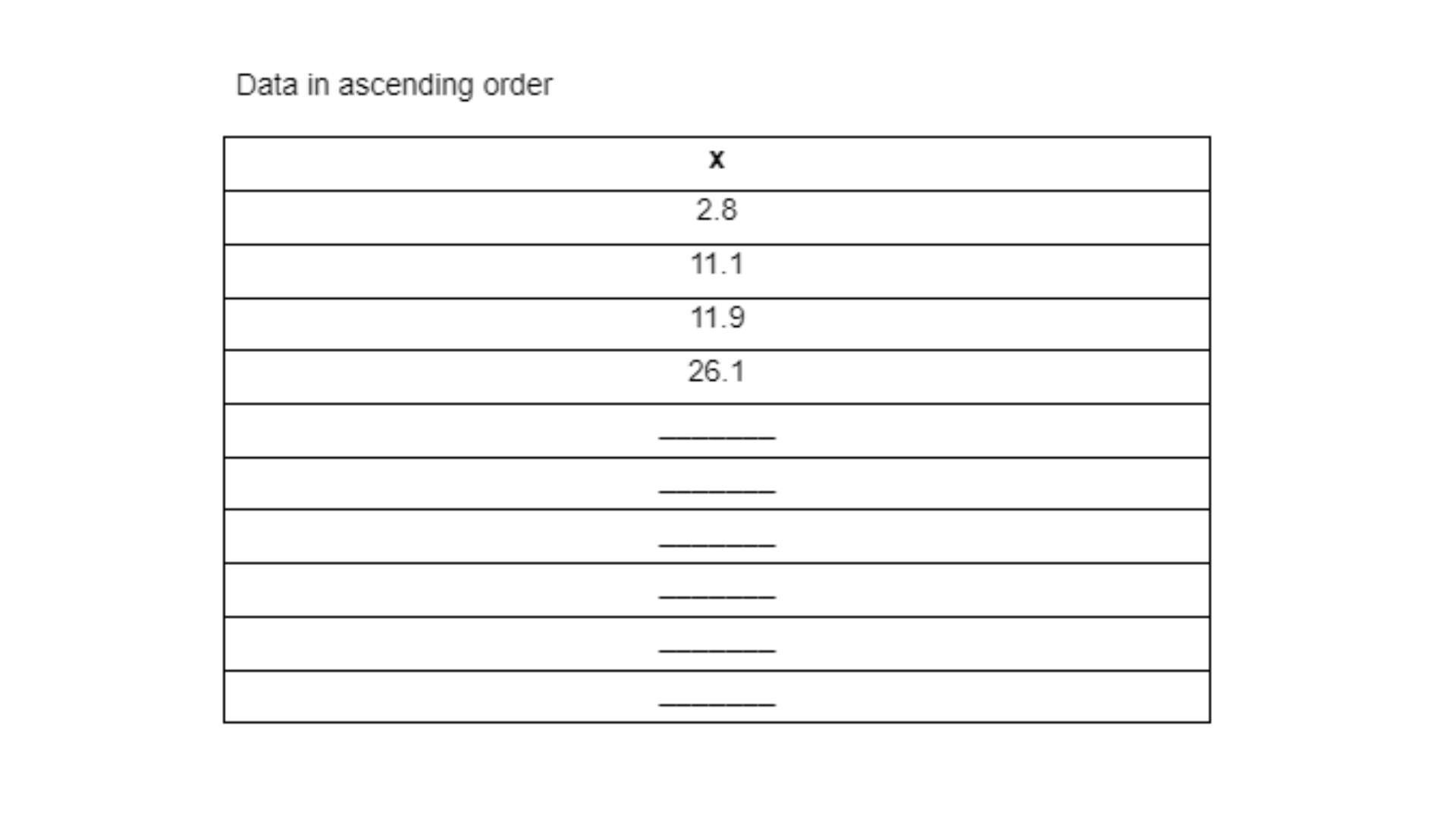
The purpose of the report is to provide an analysis of the independent variable X, dependent variable Y and the underlying relationship between the two. This has been carried out using a dataset comprising of 10 values which have been randomly assigned and indicated below.
This is only 50% of the introduction. To know more, call us at +61 871501720.
SECTION 1
Following the introduction, the first section of the report provides a solution to the questions corresponding to the variable X. This section is further divided into multiple questions which you can read below.
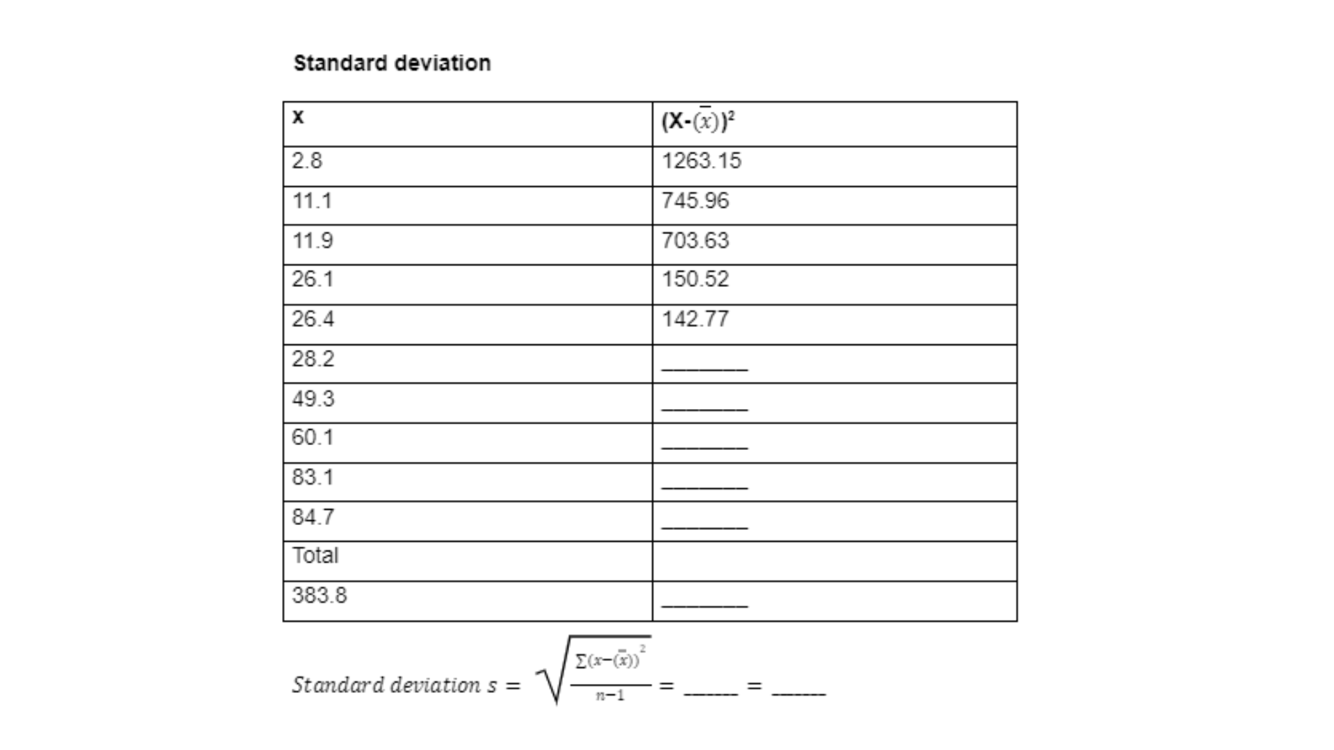
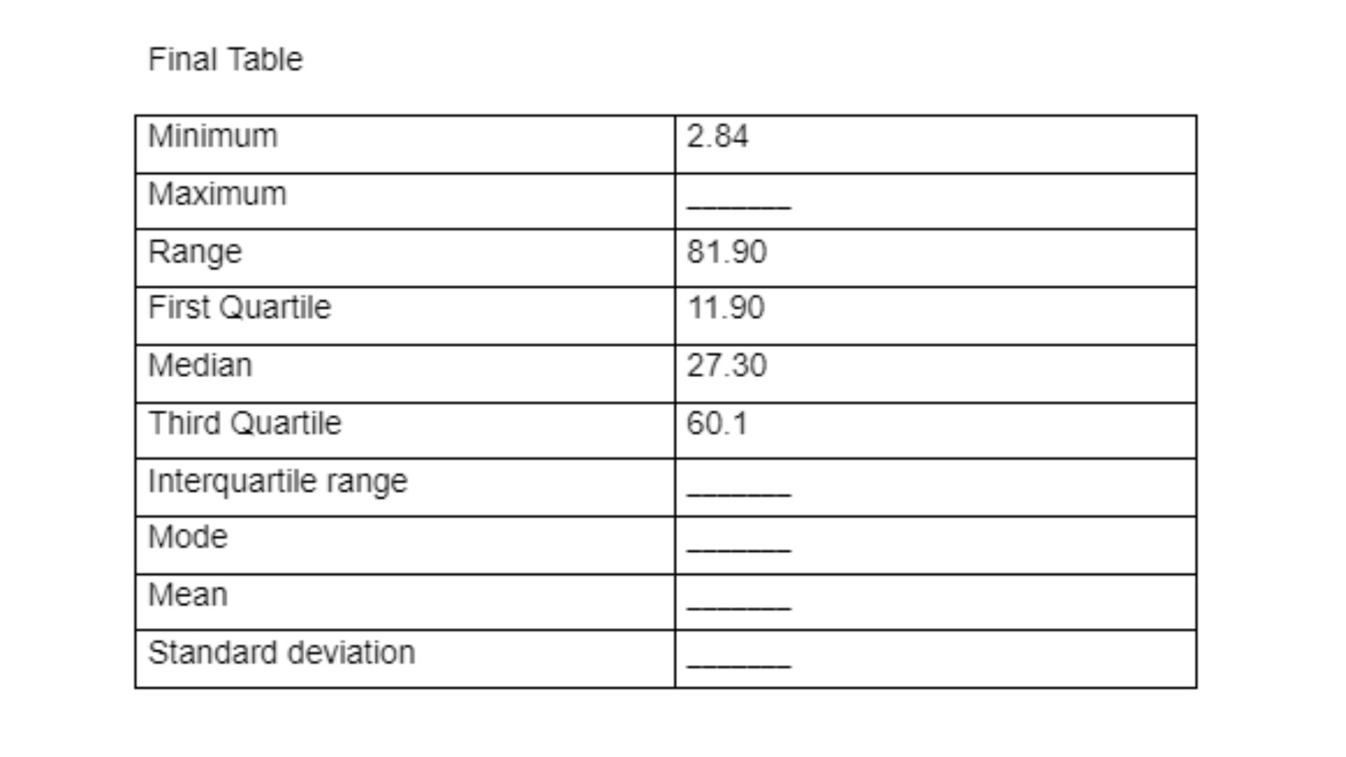
Part a
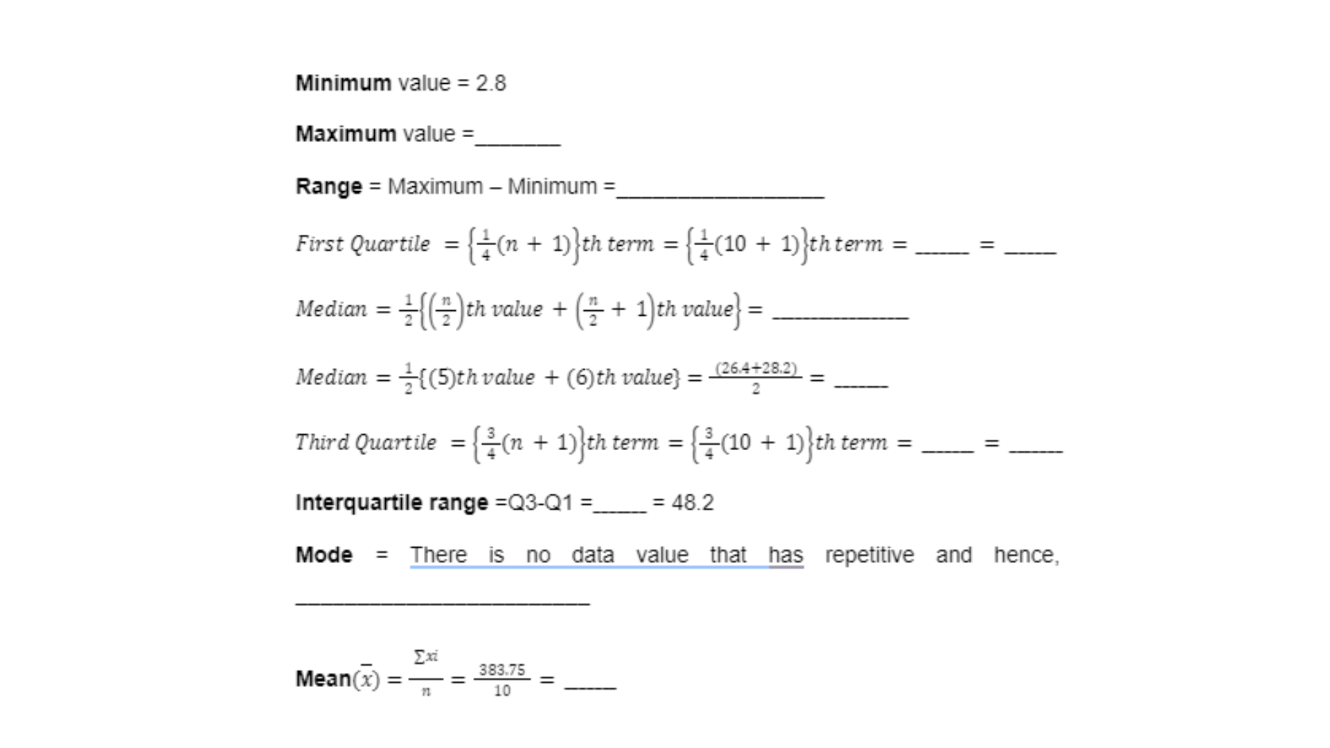
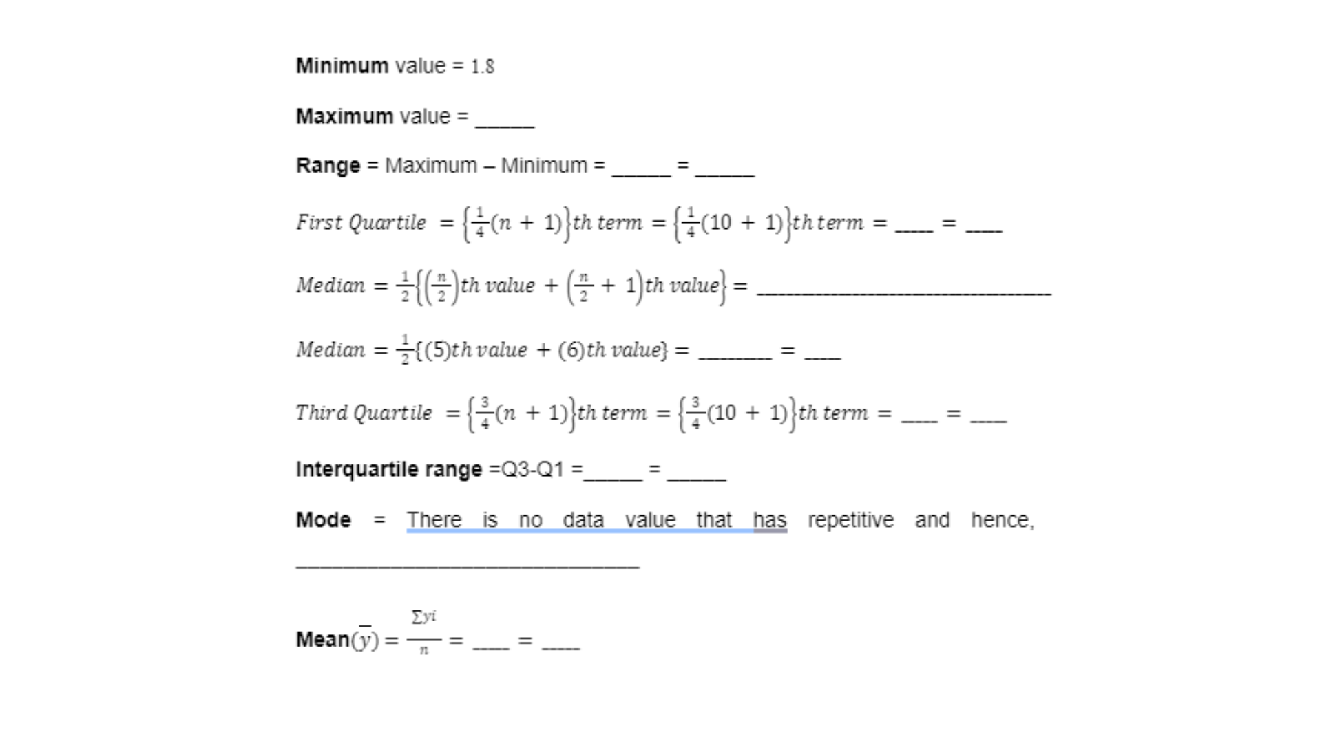
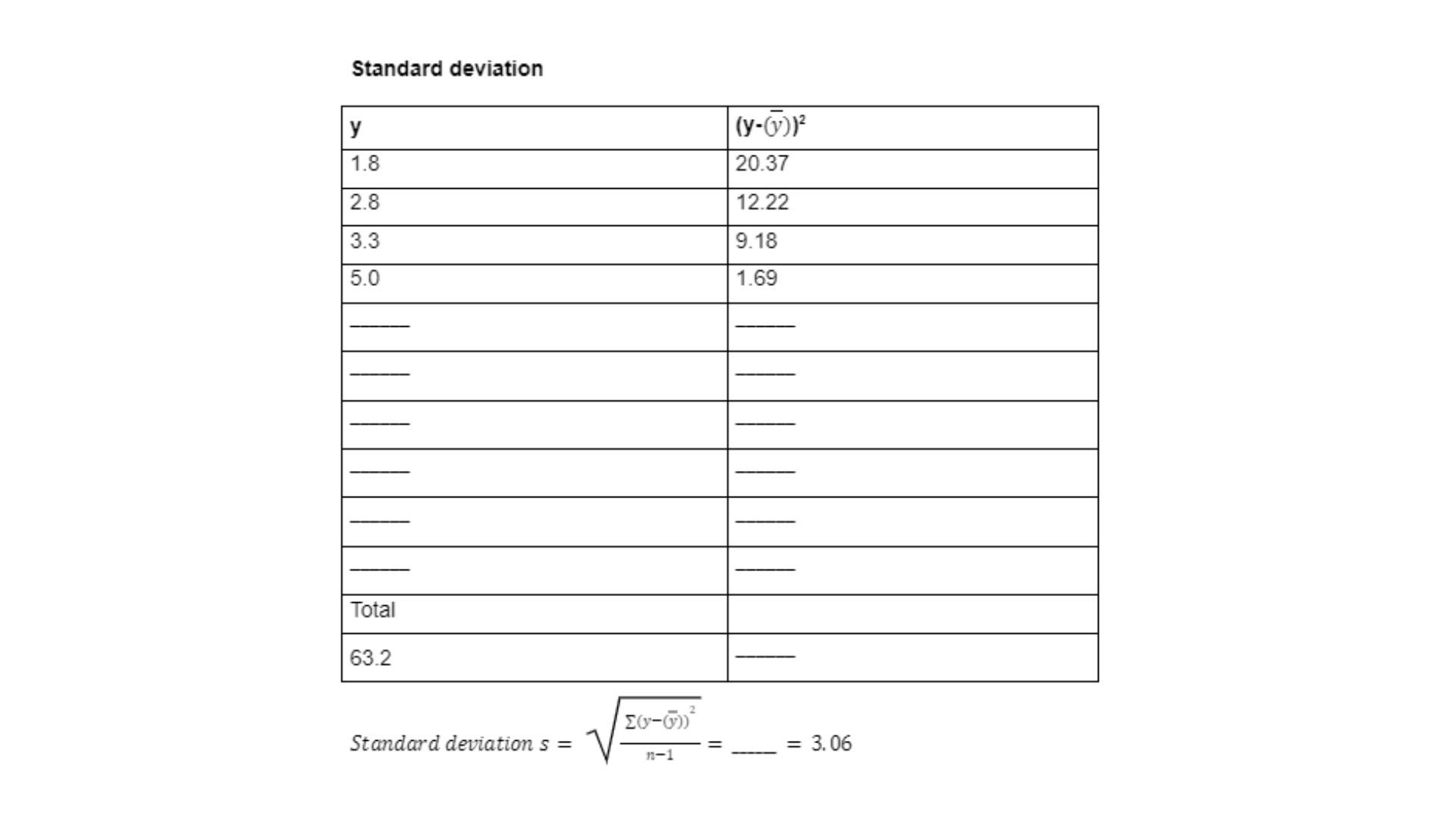
The first part requires the student to provide calculations relating to the Minimum Value, Maximum Value, Range, Q1, Median, Q3, Interquartile Range, Mode, Mean, and Standard Deviation for the dataset.
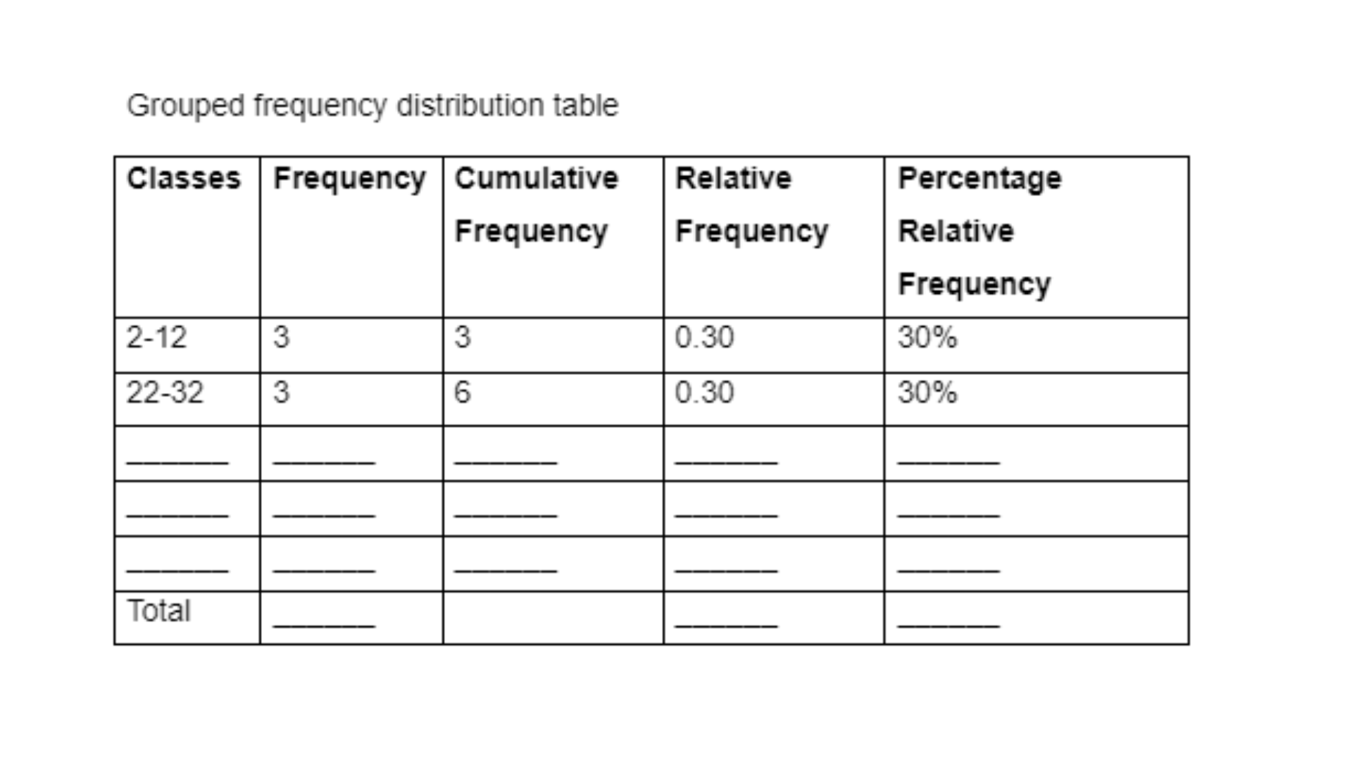
Part b
In part b, our experts have constructed a grouped frequency distribution table for the dataset according to which various aspects like Frequency, Cumulative Frequency, Relative Frequency, and Percentage Relative Frequency are calculated.
Part c
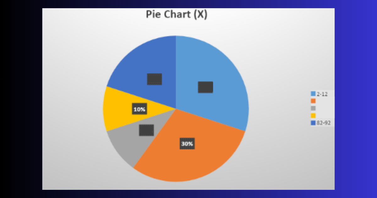
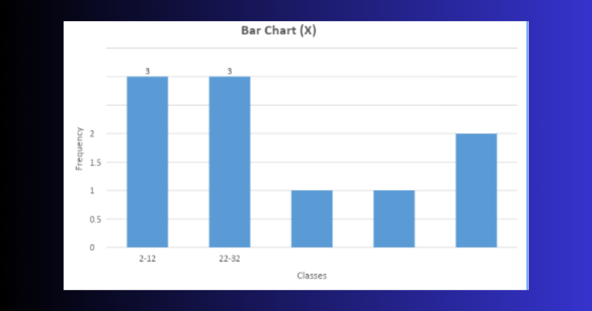
Following this, our experts have used the calculations from the above data and portrayed the data with the help of a pie chart and bar graph.
Part d
The last part of this section requires the student to provide a comment on the pie chart and the bar graph depicted above. Our experts provide a detailed explanation for the results portrayed by the graph.
Based on the Pie chart and Bar graph above, it is evident that 30% of the values lie between 2-12 and 22-32 each.
Need help with your statistical data too? WhatsApp us today at +447956859420.
SECTION 2
The next section involves statistical analysis for the dependent variable Y. Our experts have carefully analyzed the dependent variable dataset and provided supporting calculations to portray clear and detailed solutions for variable Y. This section is divided into two parts:
Part a
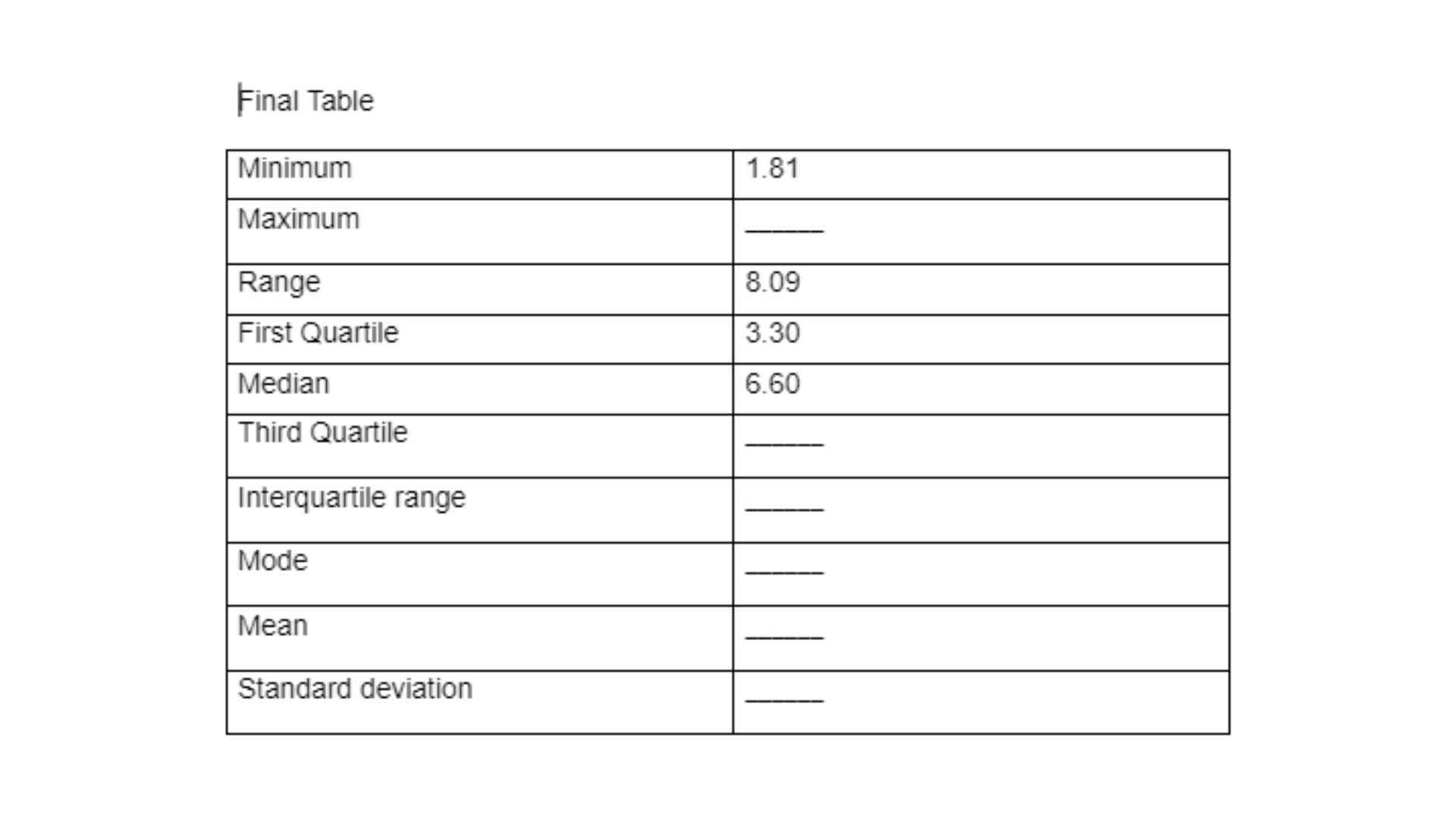
Firstly, the Minimum Value, Maximum Value, Range, Q1, Median, Q3, Interquartile Range, Mode, Mean, and Standard Deviation for variable Y need to be calculated.
Part b
The next step requires the student to provide a comment on the findings for the dependent variable. Keep reading to know how our experts have done the calculations and provided a supporting comment for the results here.
The mean value is 6.32 while the median value is 6.60. This implies that 50% of the data values i.e. 5 values do not exceed 6.60. The range for the dependent variable is 8.09.
This is only half of the calculations by our expert. Mail us at onlineassignmentservices1@gmail.com to get access to complete calculations.
SECTION 3
This section requires the students to perform statistical analysis concerning both variables X and Y to analyze the relationship between the two variables. This section is divided into four parts:
Part a
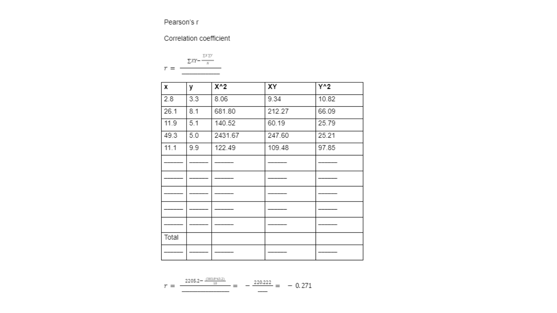
Part a for section 3 urges the student to evaluate the correlation between the two variables by calculating Pearson’s r.
Part b
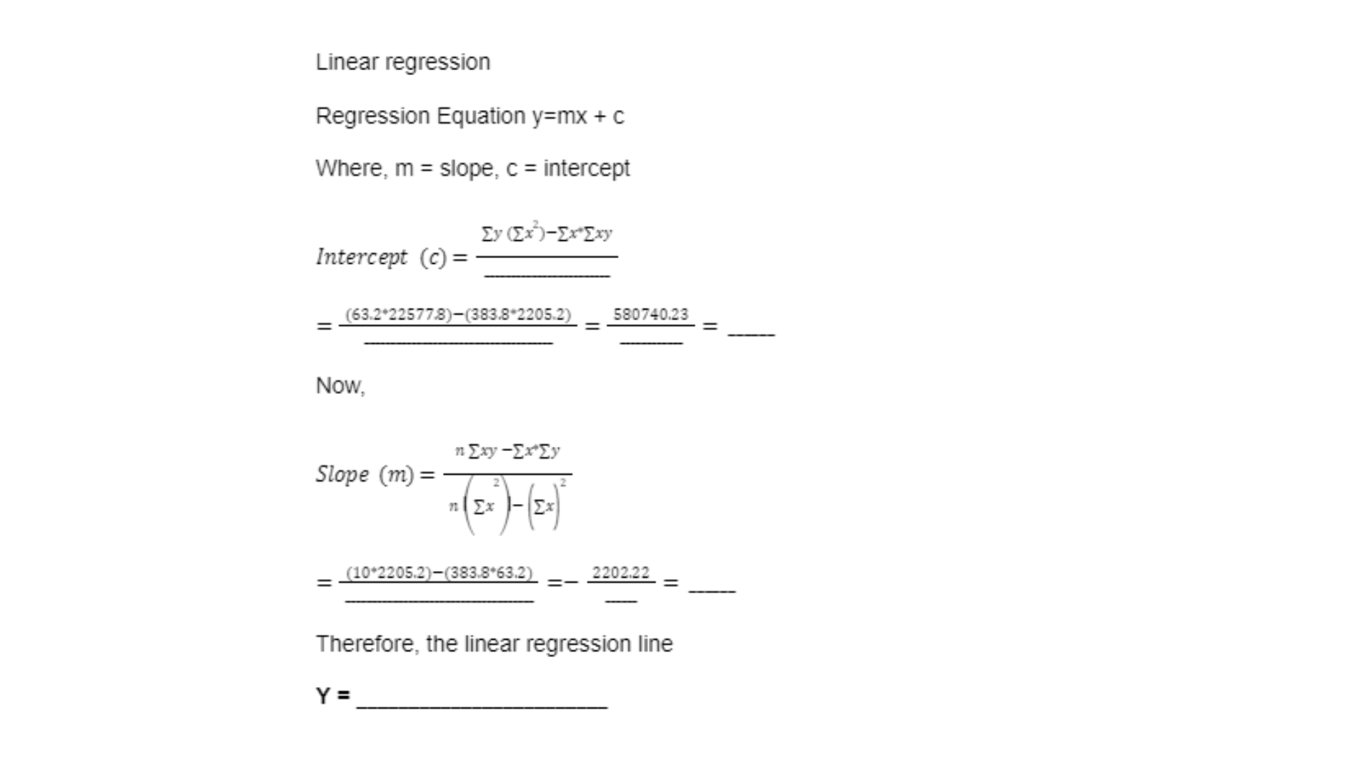
For part b of this section, a Linear Regression analysis needs to be done to assess if a change in the independent variable X can influence changes for the dependent variable Y.
Part c
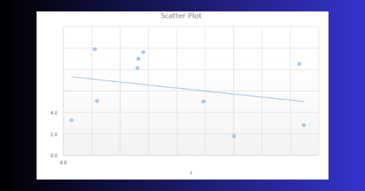
Our experts have analyzed the relationship between the two variables and displayed the findings of the data through a scatterplot in this part.
Part d
The last part of this section highlights the comments written by our experts corresponding to the results of this section regarding the relationship between the two variables.
The correlation coefficient indicates that there is a weak negative relationship between the two variables. This is also validated by the regression line where the slope coefficient is negative (Medhi, 2015).
Still confused about the correlation between the two variables? We can help, just call us at +61 871501720.
Conclusion
Lastly, the solution also provides a short conclusion to the findings of the study. Through this conclusion, our experts highlight the significant results of the analysis of the relationship between the two variables.
The analysis of independent variable X indicated that 30% of the values lie between 2-12 and 22-32 each. Only 10% values lie between 42-52 and 52-62 each. The data values seem to be asymmetrically distributed with higher frequency at the extreme values and lower frequency in the middle. With regards to the analysis of dependent variable Y, the mean value is 6.32 while the median value is 6.60.
Want expert assistance for your statistical analysis too? No need to worry. WhatsApp us at +447700174710.